Responsiveness has been a key quality feature of modern websites for a few years now. This includes first and foremost the ability to scale a website or web app to different screen sizes, including the images. Behind the scenes there is more that can be optimized. HTML5 allows for using different images depending on the visible image area using the srcset and sizes attributes on the img tag or using source tags with different media conditions inside the picture tag. This allows us to load smaller images on smaller screens, for instance on mobile devices, and save a considerable amount of bandwidth. Therefore, it’s not only a question of nice looks, but of performance as well. Check out the MDN page about responsive images for details.
When talking about responsive images, we usually talk about the same image in different resolutions. Of course, those images need to be created and there are three ways (out of the back of my head) that we can use to generate these images.
- Don’t! Simply use vector images like Scalable Vector Graphics(SVG). These images automatically scale, are usually considerably small and look good in any resolution. That is not an option for complex images like photos.
- Images of that kind can be pre-generated and loaded onto the server together with the website. That means generating all resolution variants of all images before putting the website on the server. This can take a lot of build time depending on the number of images, and maybe not all the images will ever be requested. Nevertheless, this is the solution for completely statically served websites.
- The alternative for option 2 is to create the scaled images when they are requested. Here we only load the full image onto the server together with the website / web app. When the browser requests the image in a different resolution, then the server application will generate the image in the other resolution from the full-scale image and return that. This requires a web server application that can generate the images at runtime. However, it is not necessary to create the images before letting the website / web app go live, and only those images will be created that are actually requested by a browser or other client.
None of the above-mentioned concepts are new, but we are going to take a look at how to implement option 3 using NestJS and the image conversion module sharp.
Set up the project
Let’s start by creating a project using NX. It will be a NestJS MVC project with hbs as handlebars view engine. We run the following command on the command line to create the project.
npx create-nx-workspace my-workspace --preset=nestThen we change into the directory with cd my-workspace and run the following commands to install hbs and sharp.
npm i --save hbs
npm i --save sharp
Prepare an empty page
In our fresh workspace, we make the following changes to prepare the project for the juicy part:
-
Delete the
app.service.ts. -
Create the folder
viewsinside thesrcfolder. -
Add the file
index.hbsin theviewsfolder with the following content:<!DOCTYPE html> <html lang="en"> <head> <meta charset="utf-8" /> <title>App</title> </head> <body></body> </html>This will provide us with an empty page in which we will later add the responsive image.
-
Edit
main.tsto have the following content:import { Logger } from '@nestjs/common'; import { NestFactory } from '@nestjs/core'; import { join } from 'path'; import { AppModule } from './app/app.module'; import { NestExpressApplication } from '@nestjs/platform-express'; async function bootstrap() { const app = await NestFactory.create<NestExpressApplication>(AppModule); app.useStaticAssets(join(__dirname, 'assets')); app.setBaseViewsDir(join(__dirname, 'views')); app.setViewEngine('hbs'); const port = process.env.PORT || 3000; await app.listen(port); Logger.log(`🚀 Application is running on: http://localhost:${port}`); } bootstrap();Here we set up NestJS to use express with hbs as a view engine. The view engine takes the pages from the
viewsfolder and the assets are served statically from theassetsfolder. -
Change
app.controller.tsto provide the index page:import { Controller, Get, Render } from '@nestjs/common'; @Controller() export class AppController { @Get() @Render('index') public root() { return; } }This will cause the controller to render the index page file.
-
app.module.tsshould only contain theAppController:import { Module } from '@nestjs/common'; import { AppController } from './app.controller'; @Module({ imports: [], controllers: [AppController], providers: [], }) export class AppModule {} -
Finally, we need to add the folders for the static assets to the
project.jsonin thesrcfolder, so they picked up when building the project:{ ... "targets": { "build": { ... "options": { ... "assets": [ "apps/[project-name]/src/assets", "apps/[project-name]/src/views" ] }, ... }, ... }, ... }
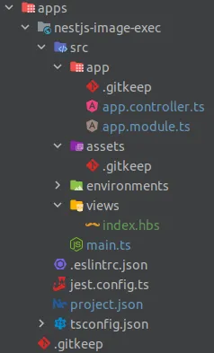
At this point, our workspace looks like this:
When we now run npm start the server application will provide the empty index page on http://localhost:3000.
Serving responsive images on demand
In order to serve a responsive image, we first need an image. This can be any considerably large image, e.g. a wallpaper. Assuming that it is a JPEG file, copy it into the assets folder and change the name to example.jpg.
Change the content of index.hbs to serve the image in different resolutions:
<body>
  <img
    srcset="/images/example_350.jpg 350w, /images/example_600.jpg 600w, /example.jpg 1000w"
    src="/example.jpg"
    alt="example image"
  />
</body>
The full-sized file is served under the path /example.jpg. This will use the automatic static serving of assets directly from the assets folder. The other images are served using a path prefix of /images. We will adjust the controller to handle these paths. The reason for this different path is that we need the controller to handle the scaled images, because they do not exist yet. The static asset provider can not serve assets that don’t exist. The image names for the scaled images follow a convention that we will need later: the name is that of the original file, followed by underscore and the required width, follow by the file type.
Whenever a scaled image is requested that doesn’t exist, we need to generate it. This will be done by the image-generator.service.ts that we create in the app folder. It’s content looks like this:
import { Injectable } from '@nestjs/common';
import { join } from 'path';
import { existsSync } from 'fs';
import sharp = require('sharp');

@Injectable()
export class ImageGeneratorService {
  public async generateImage(image: string): Promise<string | undefined> {
    const [fileName, fileType] = image.split('.');
    const [fileBaseName, width] = fileName.split('_');

    const targetPath = join(__dirname, 'assets', image);
    const basePath = join(__dirname, 'assets', `${fileBaseName}.${fileType}`);

    if (!existsSync(targetPath)) {
      if (!existsSync(basePath)) {
        return undefined;
      }

      await sharp(basePath.toString())
        .resize(+width)
        .toFile(targetPath.toString());
    }
    return targetPath;
  }
}
What does this code do? Firstly, it takes apart the name of the file. From the parts of the name it determines the
width: the width of the generated scaled image,targetPath: the path of the generated scaled image and thebasePath: the path of the full-sized image.
The next part is already an optimization. The generated image will be saved in the assets folder for the future. Therefore, the code checks first if the image has already been generated. If it doesn’t exist and if the base image exists, it will generate the scaled image using sharp and save it. I use the synchronous file exists functions here for simplicity, but I advise using the asynchronous functions in a real project.
The method returns the path of the generated file if the image exists (either because it has already been there or because it has been generated) or undefined if the image does not exist and cannot be generated because the corresponding full-sized image doesn’t exist.
The service needs to be provided in the AppModule:
  // ...
  providers: [ImageGeneratorService],
  // ...
Now we need to use the service in the controller. To do so, we inject the ImageGeneratorService in the AppController and handle the image route with the getImage method as shown below:
import { Controller, Get, NotFoundException, Param, Render } from '@nestjs/common';
import { ImageGeneratorService } from './image-generator.service';
import { createReadStream } from 'fs';

@Controller()
export class AppController {
  constructor(private readonly imageGeneratorService: ImageGeneratorService) {}

  // ...

  @Get('images/:image')
  public async getImage(@Param('image') image: string) {
    const generatedFilePath = await this.imageGeneratorService.generateImage(image);
    if (!generatedFilePath) {
      throw new NotFoundException();
    }
    const file = createReadStream(generatedFilePath);
    return new StreamableFile(file);
  }
}
Whenever a call with the path /image/[imageName]_[width].[fileType] is received, this method will try to generate the image using the ImageGeneratorService. If the image is not available and cannot be generated, the code throws a NotFoundException, resulting in a 404 HTTP return code. Otherwise, the server returns the generated image file by packing it into a data stream and returning it using the StreamableFile.
This code still needs improvements like setting the content type of the response, but it shows the necessary steps of dynamically creating responsive images. We can also add headers to the response to cache the images on the client side to reduce server load or return HTTP status code 301 (moved permanently) with a path that uses the static asset provider for future requests of the generated image. Feel free to adjust the code to your liking.
At this point we are done. You can run the server, load the website and see how the page with the image is loaded. You can also open your browser’s development tools, adjust the size of the website so that it loads a scaled image variant and confirm that behavior in the network tab.