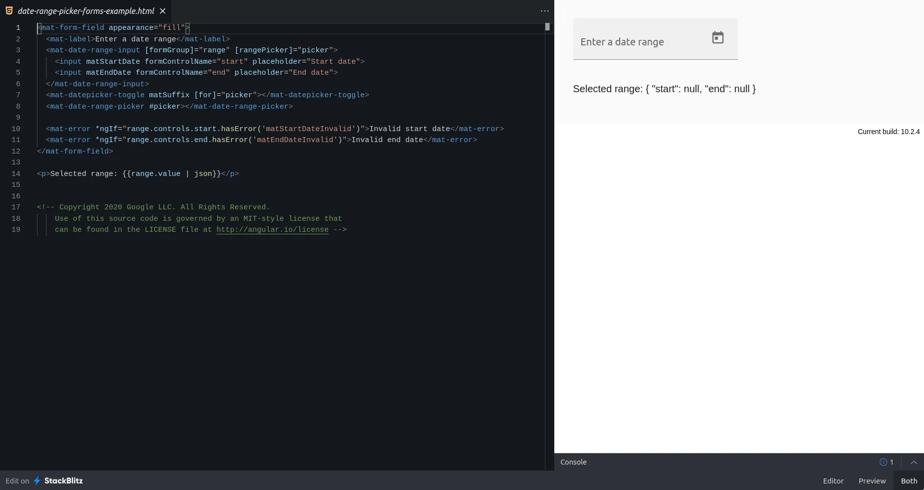
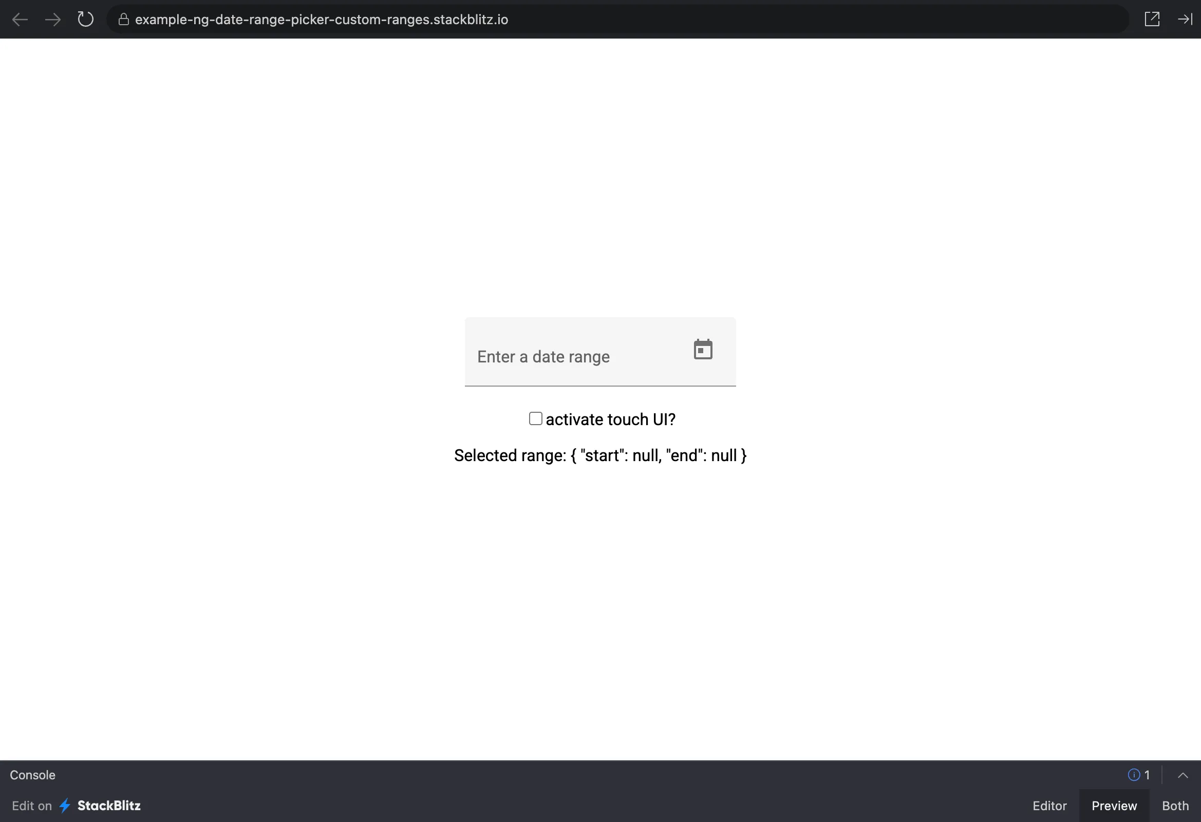
Angular 10 finally added a long awaited Material component: A date range picker! What is a date range picker? Well, as the name suggests, it provides a way for the user not only to pick one date in an input field, but two dates, which together build a time range. There are many use cases for this kind of component. One example would be the selection of a vacation period in a vacation planner app (don’t ask me, why this is the first thing that comes to my mind 🌴️).
So, how does it look like?
TL;DR
You can have a look at the complete example code in our GitHub repository or deployed to StackBlitz.
The Angular Date Range Picker
Documentation and examples can be found in a sub-section of the datepicker section of the official Angular Material page. Let’s try out the basic usage of the date range picker in this StackBlitz provided by the Material docs:
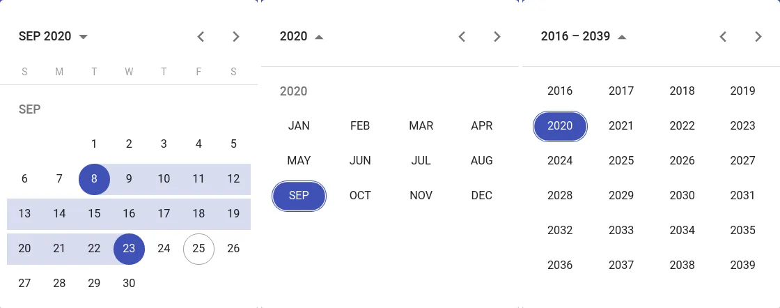
After clicking on the calendar symbol on the right side of the form field, the picker is opened, showing the current day. Its toolbar on the top enables us to switch between day, month and year view.
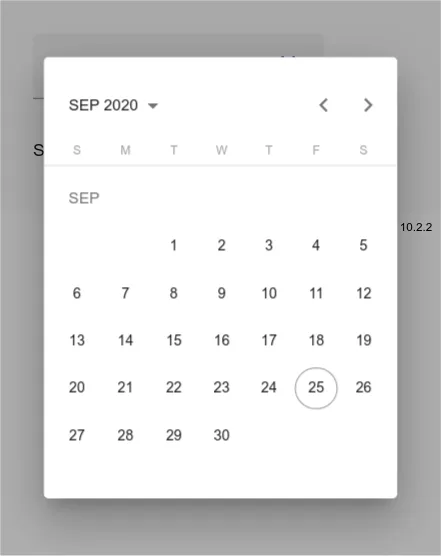
There is also a mobile / touch mode which gets activated automatically depending on CSS media queries. We can enforce this mode by using the touchUi input in the example above. Change this line to see the result:
<!-- within date-range-picker-custom-ranges-forms-example.html -->
<mat-date-range-picker #picker [touchUi]="true"></mat-date-range-picker>
Instead of an overlay that sticks to the input field, the picker now renders as a larger overlay centered in the viewport:
Custom Ranges?
The basic functionality works like a charm, but what about custom preset ranges? It’s a common use case to have pre-defined ranges like “last month” or “this week” which can be selected to set the date range. There are a couple of libraries out there, e.g. ngx-daterangepicker-material, that provide this functionality. Unfortunately, the Angular Material date range picker does not.
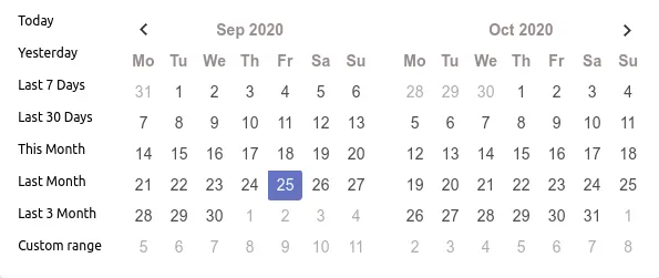
Custom Ranges!
So, what to do if we must have that “Last 7 Days” button, but want to use Material’s date range picker? Of course, we could add an additional menu button to our form field, that opens yet another overlay to choose the preset. But this would not be very intuitive for users that are used to pickers with custom range selection (and probably would look like… not very well). We want to integrate this directly into the picker component itself.
⚠️ Please keep in mind, that in doing so, we change the design of the component in a way that it does not meet the Material Design Specification anymore.
Searching through the API docs, we can find that there is one way to customize the picker component: the Customizing the calendar header section describes how the picker’s header area can be replaced by a custom component. We found a way to sneak in custom code!
Implementation of a Custom Header
In the example provided by Angular Material the default header is replaced with this one:

It rearranges the navigation items and replaces the month/year dropdown with simple arrow buttons.
1️⃣️ Start with Material’s example code
Let’s start by re-creating Material’s example code. We first create a form field, that uses a default date range picker.
@Component({
  // ...
})
export class AppComponent {
  range = new FormGroup({
    start: new FormControl(),
    end: new FormControl(),
  });
}
We add a FormGroup named range to the AppComponent, which contains two controls that hold the start and end values of the date period. Then we connect it to form field mark-up in app.component.html:
<mat-form-field appearance="fill">
  <mat-label>Enter a date range</mat-label>

  <!-- the dual input field: -->
  <mat-date-range-input [formGroup]="range" [rangePicker]="picker">
    <!-- start part -->
    <input matStartDate formControlName="start" placeholder="Start date" />
    <!-- end part -->
    <input matEndDate formControlName="end" placeholder="End date" />
  </mat-date-range-input>

  <!-- the picker trigger button -->
  <mat-datepicker-toggle matSuffix [for]="picker"></mat-datepicker-toggle>

  <!-- the actual picker -->
  <mat-date-range-picker #picker></mat-date-range-picker>
</mat-form-field>
The range FormGroup is bound to the new <mat-date-range-input> component. This new component groups two input elements (lines 7 and 9) into one input form. Instead of matInput, two new attribute directives are used to mark start and end dates: matStartDate and matEndDate. In line 13, the picker button (<mat-datepicker-toggle>) is added as suffix (rendered on the right side) of the form field. Its [for]="picker" directive connects the button via template variable with the target picker that should be opened on button click (<mat-date-range-picker #picker>, line 16).
We now have a working, default, date range input field!
Now, we create a new Angular component, that will be used as custom header. The following code is a slightly modified version of the “Customizing the calendar header” Material example code:
@Component({
  // ...
})
export class ExampleHeaderComponent<D> {
  constructor(
    private calendar: MatCalendar<D>, // calendar instance of picker
    private dateAdapter: DateAdapter<D>, // native or moment date adapter
    @Inject(MAT_DATE_FORMATS)
    private dateFormats: MatDateFormats // for formatting
  ) {}

  // active date label rendered between the arrow buttons
  get periodLabel(): string {
    // use date adapter to format the label, e.g. "SEP 2020"
    return this.dateAdapter
      .format(this.calendar.activeDate, this.dateFormats.display.monthYearLabel)
      .toLocaleUpperCase();
  }

  // called when user clicks on one of the left buttons
  previousClicked(mode: 'month' | 'year'): void {
    this.changeDate(mode, -1);
  }

  // called when user clicks on one of the right buttons
  nextClicked(mode: 'month' | 'year'): void {
    this.changeDate(mode, 1);
  }

  private changeDate(mode: 'month' | 'year', amount: -1 | 1): void {
    // increment or decrement month or year
    this.calendar.activeDate =
      mode === 'month'
        ? this.dateAdapter.addCalendarMonths(this.calendar.activeDate, amount)
        : this.dateAdapter.addCalendarYears(this.calendar.activeDate, amount);
  }
}
Note: The original example uses ChangeDetection.OnPush and a ChangeDetectionRef to keep in sync
with the calendar instance when it gets changed from the outside. We omit this here to keep it simple.
You can take a look at the full code of ExampleHeaderComponent in our example repository.
Our ExampleHeaderComponent class provides a label for the active date period (line 14) and two methods for decrementing (previousClicked, line 22) and incrementing (nextClicked, line 27) the current month or year. For this, we need access to the calendar instance used by the date range picker component. We get this access utilitizing Angular’s dependency injection mechanism: the calendar instance is injected in the constructor in line 7. Because our component will be used inside the date range picker component, its injector will find the correct calendar instance walking up the injector tree.
This calendar is then used to get and set the active date. The type of calendar.activeDate is generic, because the date picker supports both native Date objects and Moment.js (which is now deprecated). For this reason, Material provides a DateAdapter to work with calendar dates. We use this adapter to format the date string when creating the period label (line 16-17) and when manipulating the active date in lines 33-36. This is all we need to do in the TypeScript class. Next, we take a look at the HTML:
<div class="example-header">
  <!-- "previous" buttons -->
  <button
    mat-icon-button
    class="example-double-arrow"
    (click)="previousClicked('year')"
  >
    <mat-icon>keyboard_arrow_left</mat-icon>
    <mat-icon>keyboard_arrow_left</mat-icon>
  </button>
  <button mat-icon-button (click)="previousClicked('month')">
    <mat-icon>keyboard_arrow_left</mat-icon>
  </button>

  <!-- center label -->
  <span class="example-header-label">{{ periodLabel }}</span>

  <!-- "next" buttons -->
  <button mat-icon-button (click)="nextClicked('month')">
    <mat-icon>keyboard_arrow_right</mat-icon>
  </button>
  <button
    mat-icon-button
    class="example-double-arrow"
    (click)="nextClicked('year')"
  >
    <mat-icon>keyboard_arrow_right</mat-icon>
    <mat-icon>keyboard_arrow_right</mat-icon>
  </button>
</div>
No surprises here. We define two buttons each to navigate back and forth in months and years, using the previousClicked (lines 6 and 11) and nextClicked (lines 19 and 25) methods defined in the component’s class. The respecting code lines are highlighted in the listing. The periodLabel is bound to a span in the center. CSS flex box is well-suited for styling. We don’t do this here, but the component’s css is provided in the example repository.
One last thing we need to do is to inform the form field to use our header component. Back in our AppComponent, we provide our ExampleHeaderComponent type as calendarHeaderComponent input of <mat-date-range-picker>:
<mat-date-range-picker
  #picker
  [calendarHeaderComponent]="ExampleHeaderComponent"
></mat-date-range-picker>
If we try to compile now, we get an error because ExampleHeaderComponent can’t be found. Angular is unable to resolve it, because it only looks for properties of the same name in its component’s class. So, we need to add it there:
export class AppComponent {
  // make ExampleHeaderComponent type available in our template:
  readonly ExampleHeaderComponent = ExampleHeaderComponent;
  // ...
}💡️The [calendarHeaderComponent] Input expects a ComponentType<any>, not an instance of the class! We only bind the class object here, the date picker later instantiates it.
The ExampleHeaderComponent = ExampleHeaderComponent declaration looks a bit strange at first, but improves template readability.
That’s it! We now have enhanced (or changed, at least) the form field with a custom header!
2️⃣️ Add custom range panel to custom header
So far, we didn’t add something new to the Material custom header example. Time to actually implement the custom range buttons! The idea is, to add a panel to the left of the picker that contains all selectable ranges. When we’re done it will look like this:
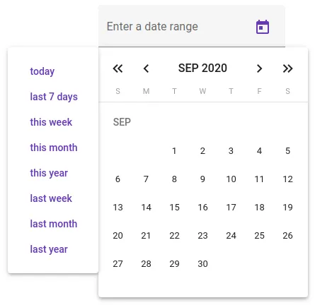
It’s not perfect (yes, it maybe would be prettier if it had the same height as the picker), but let’s concentrate on functionality here 😎️. As you can see, the panel is rendered outside of our custom header, so we’ll need enough CSS magic ✨️ anyway.
Respecting the single responsibility principle, we start by creating a new component for our panel:
CustomRangePanelComponent class (partial):
const customPresets = [
  'today',
  'last 7 days',
  'this week',
  'this month',
  'this year',
  'last week',
  'last month',
  'last year',
] as const;

// equivalent to "today" | "last 7 days" | … | "last year"
type CustomPreset = typeof customPresets[number];

@Component({
  selector: 'app-custom-range-panel',
  // ...
})
export class CustomRangePanelComponent<D> {
  // list of range presets we want to provide:
  readonly customPresets = customPresets;

  // called when user selects a range preset:
  selectRange(rangeName: CustomPreset): void {
    // ... implementation follows
  }
}
Nothing special so far, besides some TypeScript magic.
So let’s take a little TypeScript field trip: In customPresets we define a list of all ranges we want to show in our template. The list is declared as const in line 10. In doing so, its type is narrowed from a general string[] array to
readonly ['today','last 7 days',…,'last year']
which is a tuple containing exactly the given string literals in the given order: 'today', 'last 7 days' and so on. This enables us to infer type CustomPreset (line 13), which is a type union of all possible values in customPresets:
"today" | "last 7 days" | … | "last year".
We use this type for the argument of selectRange (line 24), so we will get a compiler error, if we try to call this method with an invalid string 💪️. We can make use of another advantage called exhaustiveness checking, which we will learn about more below.
CustomRangePanelComponent template:
<mat-card class="mat-elevation-z3">
  <button
    *ngFor="let item of customPresets"
    mat-button
    color="primary"
    (click)="selectRange(item)"
  >
    {{ item }}
  </button>
</mat-card>
The template of our new component is quite simple. We use a Material card component with class mat-elevation-z3 to match the date picker style. Inside ot it, we add a button for each customPresets item. When the user clicks on the button, selectRange is called with the item as argument.
💡️We prepared selectRange to only accept valid strings of type CustomPreset. To benefit from this in our template, however, we must enable Angular’s template type checking in tsconfig.json’s compiler options. Otherwise, the compiler will ignore template type errors.
CustomRangePanelComponent styles (SCSS):
$width: 128px;

:host {
  position: absolute;
  width: $width;
  left: -$width;
}
To render the panel to the picker’s side, we position it absolutely. Then it is moved its width in pixels to the left (line 6). If you want to move it to the right side, use right: $width instead.
Stick it together
Finally, we need to actually use our new component. Add it as view child on top of example-header.component.html:
<app-custom-range-panel></app-custom-range-panel>

<div class="example-header">
  <!-- … -->
</div>
Done already! There should be a happy little panel now when toggling our form field’s picker! When clicking one of its buttons, …nothing happens. Well, we didn’t implement selectRange, yet!
CustomRangePanelComponent class (continued)
selectRange needs to do two things:
- Calculate start and end dates from the given
CustomPresetparameter - Set the calculated start and end dates and close the picker
Let’s start with the date calculation.
constructor(
  private dateAdapter: DateAdapter<D>,
  //...
) {}

private calculateDateRange(rangeName: CustomPreset): [start: D, end: D] {
  const today = this.today;
  const year = this.dateAdapter.getYear(today);

  switch (rangeName) {
    case 'today':
      return [today, today];
    case 'last 7 days': {
      const start = this.dateAdapter.addCalendarDays(today, -6);
      return [start, today];
    }
    case 'this year': {
      const start = this.dateAdapter.createDate(year, 0, 1);
      const end = this.dateAdapter.createDate(year, 11, 31);
      return [start, end];
    }
    // ...
    // all other cases
    // ...
    default:
      return rangeName; // exhaustiveness check
  }
}

private get today(): D {
  const today = this.dateAdapter.getValidDateOrNull(new Date());
  if (today === null) {
    throw new Error('date creation failed');
  }
  return today;
}
For this, we add a private calculateDateRange method to our CustomRangePanelComponent. It expects a rangeName parameter and converts it into a [start, end] tuple of generic type D (remember, this is the generic date type also used in the custom header component). We use a switch statement to differentiate between all range names. The specific calculations use various DateAdapter methods, but are not that interesting and can be looked up in the linked repository.
Remarkable is line 26, which showcases another benefit from using CustomPreset instead of string as parameter type: we can instruct the compiler to fail compilation, if we don’t provide a case definition for each possible rangeName value! This is called an exhaustiveness check and takes advantage of the never type. rangeName has type never, if every possible value is handled in the switch. It is the “impossible” type, so returning it doesn’t change the return type of the method ([start: D, end: D]). If we would add another range value, e.g 'next year', to our customPresets array, though, the CustomPreset type would be changed (| 'next year' would be added to the type union). This results in the switch to not handle 'next year' and thereby changing rangeName’s type from never to 'next year'. We would get a compiler error which reminds us to extend our calculateDateRange method 💪️.
Second on the list was to set the calculated start and end dates and close the picker. How do we get access to the picker? Dependency injection! Remember, that our CustomRangePanelComponent is a child of ExampleHeaderComponent, which in turn is a child of the Material picker. So we can inject it in our constructor:
constructor(
    private dateAdapter: DateAdapter<D>,
    private picker: MatDateRangePicker<D>
  ) {}

selectRange(rangeName: CustomPreset): void {
  const [start, end] = this.calculateDateRange(rangeName);
  this.picker.select(start);
  this.picker.select(end);
  this.picker.close();
}
We call the picker’s select method two times. First with the start and then with the end date of the period we calculated in calculateDateRange. This updates the selected values of the picker and its calendar. If we would inject the calendar and set the values there, the picker would’nt notive the changes. That’s why we directly use the picker here. After this is done, we immediately close the picker, because it means that the user has made their choice.
We have created a working date range picker with custom range pre-selects!
3️⃣️ One last thing: touch UI
The range selects are working now in “normal” mode, but what’s with touch mode? If we set [touchUi]="true" on the picker (see the first section of this article), we don’t see our panel! That’s because the CSS styles of the Material component differ. A panel at the side of the picker won’t do in this case, anyway, because there is little space left there on small devices. With a little extension of our code, we can easily show the panel on top of the picker, though:
// in CustomRangePanelComponent

@HostBinding('class.touch-ui')
readonly isTouchUi = this.picker.touchUi;

constructor(
  private dateAdapter: DateAdapter<D>,
  private picker: MatDateRangePicker<D>
) {}
To be able to adapt our CSS in case of touch UI mode, we use a HostBinding to add class "touch-ui" to our host element if picker.touchUi is true. We only have to do this once, because our panel component will be newly created every time the picker is opened.
In the style sheet, we can now define CSS that gets evaluated when "touch-ui" class is set on the host element:
:host(.touch-ui) {
  position: relative;
  left: 0;
  display: flex;
  flex-wrap: wrap;
  width: 100%;
}
Disclaimer: This styling is very improvable. It will cause scrollbars in some most viewport sizes.
Let’s try out the result:
Summary
Congratulations, if you made it down here! We learned quite a bit:
- We started with the basic usage of the Angular Material date-range picker.
- Then we analyzed Materials custom header example.
- We extended this example with a custom panel that contains buttons to select pre-defined date ranges. Angular’s Dependency Injection framework came in handy in this.
- On the way, we learned about how to use TypeScript’s readonly tuples to infer a useful type union that enables us to check for exhaustiveness in a switch-case statement.
The complete example source code can be found in our GitHub repository and on StackBlitz. Feel free to copy and improve it!
